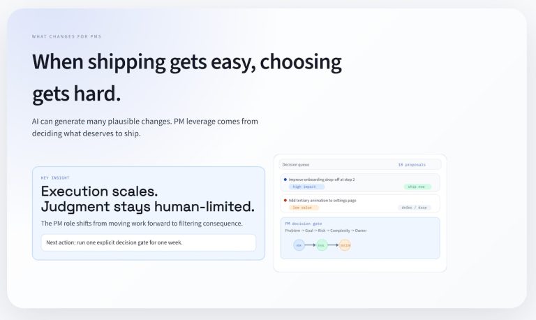
Effective dashboards mean answering a small set of questions exceptionally well.
You can have a beautiful design that progressively reveals information and elegantly filters records, but people will remember whether they were able to solve their most important questions in a few clicks.
You’ll earn double points if the design of that dashboard lends itself to follow-on questions that are related to the same data set and appear to emerge easily when you use that dataset.
How do you increase your chances of getting this outcome?
- Start with the questions
- Understand what the data represents
- Choose the minimal visuals that answer those questions
- Keep everything on a single page
- Make the limits obvious
When dashboards fail, it’s often because teams invert this order by starting with the tool, designing the dashboard first and thinking later about the questions they wanted users to answer.
One way to practice this is to start with almost any CSV file of data, review the data fields, and think about the kinds of questions that could be answered.
Getting started by finding a dataset
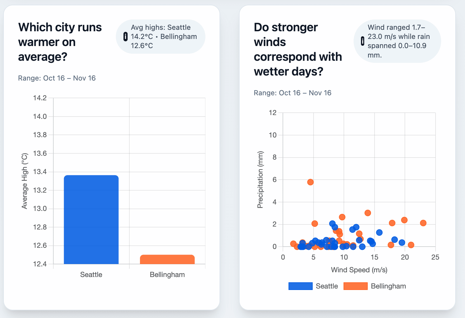
Weather data is simple and everyone’s used to reading it on a daily or weekly basis. Starting with data fields like temperature, rain, and wind in a time series, you have everything you need to build a dataset.
You might want to know:
- Trends: temperatures over time
- Comparisons: city vs. city
- Distributions: variability of highs
- Extremes: hottest or wettest days
- Relationships: wind vs. precipitation
Reasonable questions might look like this:
Weather is the “hello world” dataset for dashboard literacy. Nothing about this workflow is weather-specific, and you can apply the ideas of time-series data to other kinds of datasets that you’ll see in the workplace.
If you have a CSV with:
- a time column
- a category column
- and numeric metrics
…the same method applies.
Why use an LLM to get started?
When you collaborate with an LLM to take a CSV and shape it into a dashboard, you’ll also feel ok throwing it away and refactoring as you get different design ideas.
You’re speed-running a workflow that you’re going to use repeatedly:
- restate your schema
- generate real questions
- identify limitations
- build visuals
- produce a one-page dashboard
Weather is training wheels. The skill is universal.
Don’t just ask “build me a dashboard”
LLMs need need to be grounded them in the data and the questions, or they will hallucinate. Don’t expect the bot to refuse; expect it to happily provide an answer that’s incorrect.
With vague instructions, the model will:
- invent relationships
- infer meaning from column names
- fabricate categories
- pick arbitrary “interesting” questions
- generate charts that look right but answer nothing real
A prompt like:
“Here’s a CSV — build a dashboard.”
is not specific enough to build a usable output.
The only reliable fix is structure:
- Tell the model what the data represents
- Have it generate and refine questions first
- Force every chart to map to a specific question
Practicing your dashboard skills
To test this, let’s build an example data dashboard using weather data.
Let’s get started! For this example, I used OpenAI’s codex model, and you could use Claude or Cursor Agent or Gemini and I’d expect slightly different outputs.
First, download two csv files of weather data.
- Go to meteostat.net and search for a weather station and time frame.
- Download daily weather data for two cities (I picked 30 day files for Seattle, WA and Bellingham, WA). For each link, click export and select the CSV option.
- Save the files in a directory using the names “seattle.csv” and “bellingham.csv”
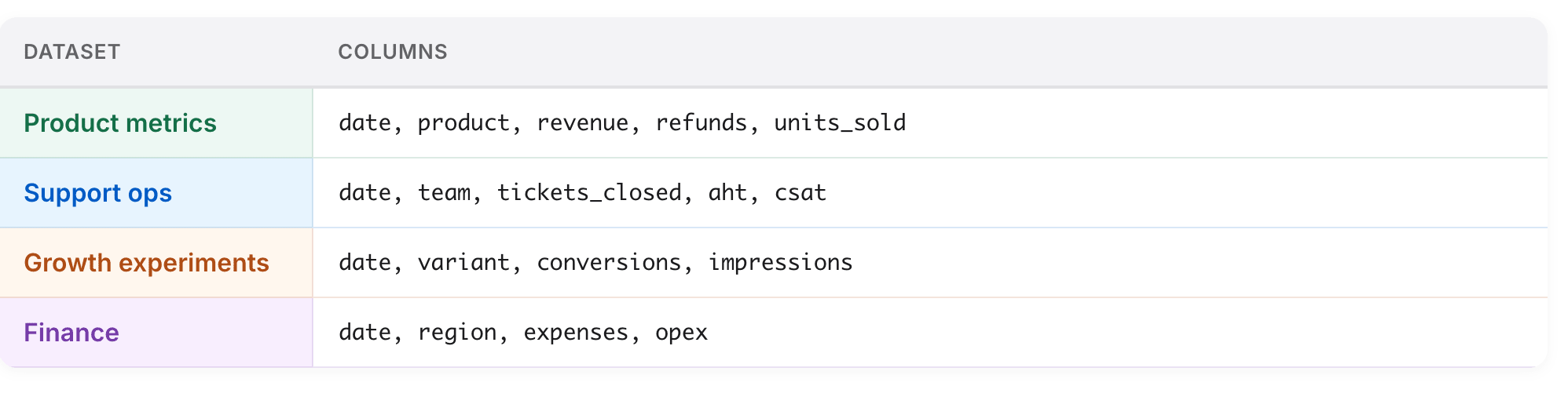
Meteostat gives you consistent fields:
date, tavg, tmin, tmax, prcp, wdir, wspd, wpgt, pres, tsun
We’ll use:
datetmintmaxprcpwspd
The LLM will add a city column automatically based on the filename.
Understanding the data by talking to an LLM
To orient the bot, you’re going to give it both a general idea of what to do, and a specific dataset. A more advanced vibe-coding version of this dashboard might support arbitrary CSV file loading, but let’s skip that for now and keep it simple.
Here’s the prompt we’re using to help the bot get started:
You are a data analyst.

Each CSV is daily weather data from Meteostat.
Each row represents one city on one date.

Columns include:
date, tavg, tmin, tmax, prcp, wdir, wspd, wpgt, pres, tsun

Here are the files:

--- FILE: seattle.csv ---
[PASTE seattle.csv CONTENTS HERE]
--- END FILE ---

--- FILE: bellingham.csv ---
[PASTE bellingham.csv CONTENTS HERE]
--- END FILE ---

Please restate what this dataset represents:
- the grain (what one row means)
- what the important columns represent
- what questions this dataset can support
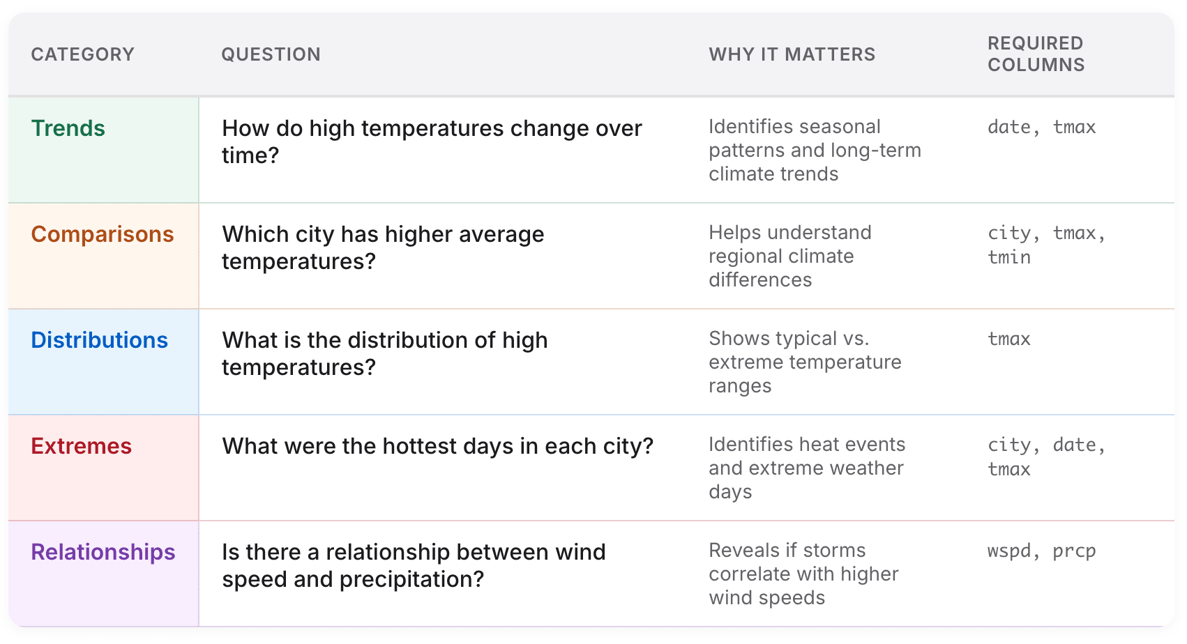
Generate the questions your dashboard should answer
Now, use that starting point to create a series of data-driven questions:
Using this dataset, generate 15 questions a curious person might ask.

Group them into:
- Trends
- Comparisons
- Distributions
- Extremes
- Relationships

For each question:
- explain why it matters
- list which columns it requires

Then select the 6–8 most important questions that fit on a single-page dashboard, and suggest possible visualizations.
Now, build the dashboard
Finally, use the combination of data and questions and tell the bot what kind of dashboard you’d like to build.
You are a front-end engineer.
I downloaded two daily weather CSVs from Meteostat.
Both have the same columns:
date, tavg, tmin, tmax, prcp, wdir, wspd, wpgt, pres, tsun
I saved each file using the city name:
- seattle.csv
- bellingham.csv
Below are the full CSV contents.
--- FILE: seattle.csv ---
[PASTE seattle.csv data HERE]
--- END FILE ---
--- FILE: bellingham.csv ---
[PASTE bellingham.csv data HERE]
--- END FILE ---
----------------------------------------
YOUR TASKS
----------------------------------------
1) Parse & merge the data
- Read each CSV.
- Add a `city` field using the filename (capitalized).
- Keep only: `date`, `city`, `tmax`, `tmin`, `prcp`, `wspd`.
- Combine into:
```js
const weatherData = [ ... ];
Create a modern “Two-City Weather Dashboard” using Tailwind (CDN) + Chart.js (with date adapter, no extra fetches). Embed the provided weatherData array directly.
Layout
Gradient hero with title/description.
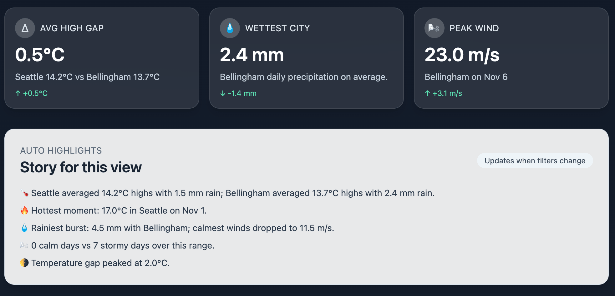
Three KPI cards (avg high gap, wettest city, peak wind) each with an icon, headline, detail line, and a trend/delta line.
Filter panel (glass card) containing:
- City checkboxes
- Validated date pickers (show full date)
- Temperature & wind sliders with live min/max labels
- Filter summary chip, Reset button, “Need tips?” accordion
- Preset buttons (“Calm Days”, “Storm Week”, “Warm Stretch”) that change multiple filters
- Active-filter chips (clickable to reset individual filters)
Auto “Story” panel listing three bullet insights based on current filters.
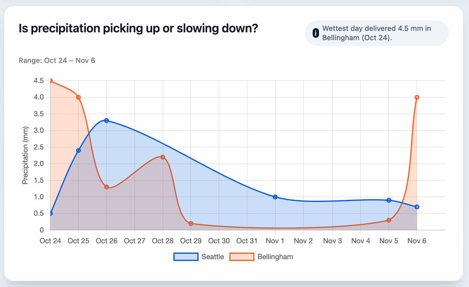
Chart grid (1 col mobile, 2 col desktop) with five cards: high-temp trend, low-temp trend, precipitation trend (filled), average-high comparison bar, wind vs precipitation scatter.
Each card needs: question-style h2, info bubble describing the viz, fade animation on redraw, and an overlay that appears when no data matches (with Reset button).
Behavior
Filters re-render all charts, KPI cards, info bubbles, story bullets, and the filter summary with smooth fades.
Hero deltas compare early vs late portions of the filtered data (show “↑ +0.8°C” style text with contextual coloring).
Preset buttons and filter chips update state instantly.
Entire page is self-contained (no fetch requests).This yields a modern, interactive, single-run dashboard.
Note: it might need a few turns to get right where you ask the LLM for a plan, and then iteratively improve that plan. You can use a prompt like this one to get better results:
Review the file and propose a step-by-step plan to modernize and enhance the dashboard’s visuals, interactivity, and storytelling.

I want a concise list of improvements grouped by theme (layout, filters, charts, narrative, responsiveness).
Evaluate what the dashboard can’t answer
An LLM will not be able to know what makes a good result, so you need to give it some feedback. This prompt will help you to check if your dashboard answers the initial questions.
For each of our 6–8 key questions:

1. Can the dashboard answer this? (Yes / Partly / No)

2. If yes, which chart answers it?

3. If no, what additional data or chart would be required?

Return the results in a table.
After this exercise, you’ll have a better idea of what your data supports.
Quality checking the output
Your dashboard wouldn’t be any good if it didn’t answer the questions well. You can see clearly over this date span that we had a pretty rainy weekend in Bellingham, WA on November 6, and it wasn’t quite as rainy in Seattle, WA (about 80 miles away).
Designing dashboards is much more than selecting a visualization to answer some questions. You also need to consider:
- schema (what fields are available, and how do they relate to each other)
- grain (what’s the lowest common demoninator available for this data – is it hourly, daily, weekly, or other?)
- question relevance (what are the questions we could possibly answer?)
- visual mappings (what’s possible to see in the report?)
Turning CSV data into a trustworthy dashboard is a great pattern for data operations in general. You create information that’s grounded in the data, answers questions, and is honest about constraints.
The best part? It’s easy to map this exercise to other datasets you might create. Weather is the scaffolding, and this works for any data.
What’s the takeaway? Creating a dashboard in a low-stakes environment is a great place to practice using LLMs to analyze data. Clarify the problem you’re solving, and create a system of repeatable insight delivery.