For a good portion of my career, I’ve been waiting for a robot to build me slides in a slide presentation. Not just any slides, but the kind of infographics that a leader asks for to tell a data-driven story at a meeting.
The kicker is almost always that the underlying data that drives the slides produces a boring story, so the team tries to spice things up and tell the most interesting version of the data possible given the time and design constraints of the problem. Through heroic effort, they make an amazing presentation. And then, slightly after (or slightly before) presentation time, a leader asks for a small change, not knowing how easy or hard it is to make the slide better.
At this point, you have a choice
In the perfect outcome, you’d have a magical robot that could take the data behind your slides, update and edit the presentation content, and produce a new slide.
Want to pivot that data table to a new dimension and tell a different part of the story? No Problem!
Want to create a sensitivity table showing a what-if analysis and do it in the same graphical style, but make it something we can edit in Figma? No Problem!
You can choose to fork your design and build what the customer is asking for, knowing that future versions of your graphic and data story will need to be updated by hand, or you can create an automated visualization that has the correct data, and … just doesn’t look all that exciting.
Typically, we make a choice between “it looks great with the final_final version the data” or “it looks a little bit weird, but it updates instantly.”
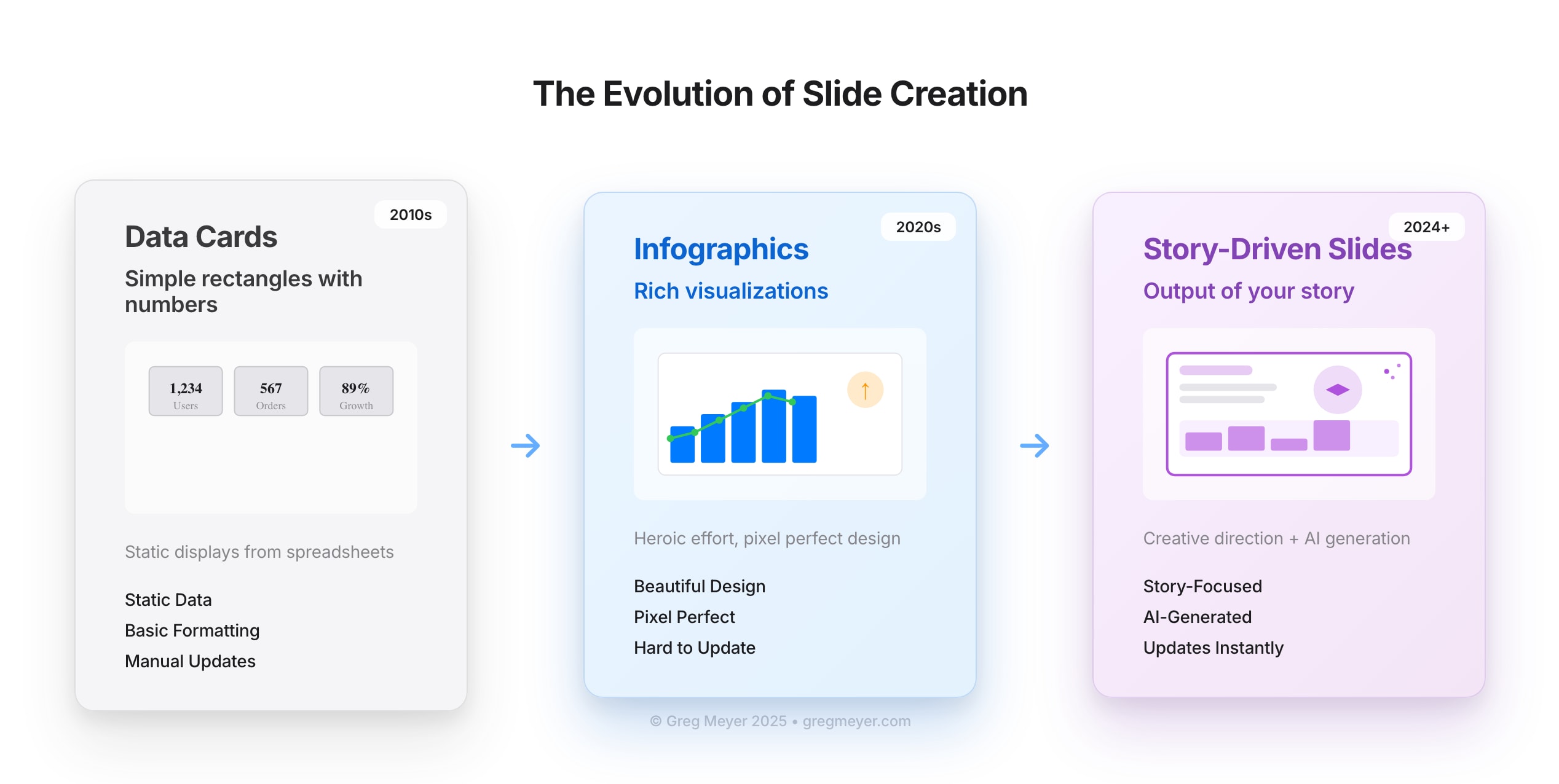
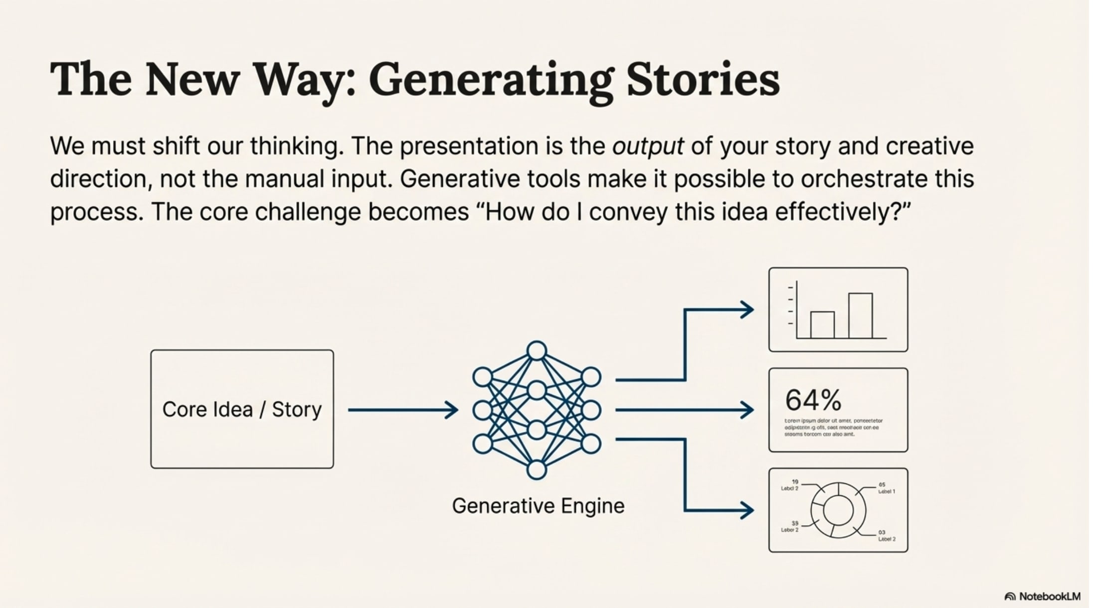
We’re getting close to the point where the slide portion of your presentation is going to be the output of your story and your creative direction, rather than a manual paste-together mark up of fonts, shapes, and colors.
We’ve moved from simple data cards to infographics
About 18 months ago, I wrote about Data-Driven Stories and defined the idea this way: “A data-driven story shows a change (or lack of change) in a process over time and identifies the next action needed based on the semantic goals of the business.”
Infographics, we thought, were data cards that moved beyond just the number on the card and started to tell a story that delivered insight beyond the basics of today’s number.

Zoom out and consider the impact of time on your graphics and your slides. If you truly explore a problem interactively, it will be possible to build your infographic outcomes in real time based on the questions the audience asks. There’s a small problem interwoven here: the outcome won’t be deterministic.
So on the good side, we’ll be able to build anything we want, and soon. The fidelity will continue to improve and you will be able to change your formatting and rebuild the presentation immediately. But it won’t be pixel perfect, yet.
NotebookLM and the auto-generated slide deck
If you’ve been watching the presentation space you may have seen tools like Stick (Acquired by Google), Gamma, Pitch, and others. These presentation tools promise to create visually consistent decks powered by generative AI. Some are more cautious (Pitch) while others lean into the generation (Gamma) and aim for “good enough and improving.”
Google introduced NotebookLM in May 2023. The intention was to combine a number of resources to synthesize knowledge and reframe it with a variety of tools. You’d add a PDF, a website, and then ask a bot to explain it to you. The next big leap was in September 2024, when a podcast-like feature was added that explained the content as if on a radio play.
And now NotebookLM makes slides. Here are some examples it created from the text of this post.
It’s pretty good. I’m not going to give in and say that it’s better than a person in expressing these ideas but it’s quite effective for a zero-shot prompt.
Using stories to sell ideas
We use slide decks to pitch ideas because a picture or a visual presentation is worth the proverbial thousand words. No one wants to read a multi page PRD when they can view the prototype. No one wants to read the whole report when they can see an infographic of the highlights and the TL;dr. But they do want all the graphics to use real numbers. They do want the ideas to be consistent. And they do want the strategy to foot and produce results.
Here’s what NotebookLM called out as an important note:
What if the real innovation of data driven stories (or infographics) created by generative AI lets us relax from the idea of a pixel-perfect slide?
I’m not suggesting that we support incorrect information or hallucinations. I’m asking the question: what do we use these artifacts to create?
I believe the point of a slide deck is to share ideas, gain consensus, and achieve an outcome on an idea or a decision. The best way to do that is with a great story. And it’s easier to tell a story with great visuals.
A new way of building presentations
If the presentation tools of the near future are non-deterministic, how do we improve the way that they create value? By borrowing the techniques from software engineering and dynamically created content in other forms.
At the core, we need a data schema to define the slide itself. A very simple version would include the title, subtitle, main content, and footer. You might have a slideType that would tell you like in Google Slides or Powerpoint what kind of layout you need. For each slideType, you have a prompt that defines the slide and how it renders, and you need a method of testing the output with Evals so that you can test for stylistic and other errors.
Then, each slideType might have individual components that understand how to ingest data, calculate, and render an outcome. Perhaps you have a storyBlock, a barChart, a comboBlock, or a CTA button. (If this is starting to sound like building a modern, responsive, React application you’re probably not far off).
What makes this possible for wide use? The editing. It’s a product challenge to take the core of this presentation engine and infuse it with enough creativity to build prompts on prompts on prompts and also not have it devolve into AI Slop. When users need to edit content, you also need to make it clear what sorts of edits are possible.
Editing a label might be very different than the implication of editing underlying data series that flow through the whole presentation. This implies that you need a “design editor” agent to tell you whether your presentation is good or meh.
The story at the center
However we’re building presentations in the future (or the present), the story needs to be at the center of each slide. Don’t think of the challenge as “how do I build slides” — the answer needs to be “how do I convey this idea effectively”, or “how do I inspire wonder and creativity?”
Generative tools make many different outputs possible, and they also cheapen some of the hard work that goes into directing the parts of the orchestra to deliver a great outcome. As you are thinking about data-driven stories, don’t miss the point.
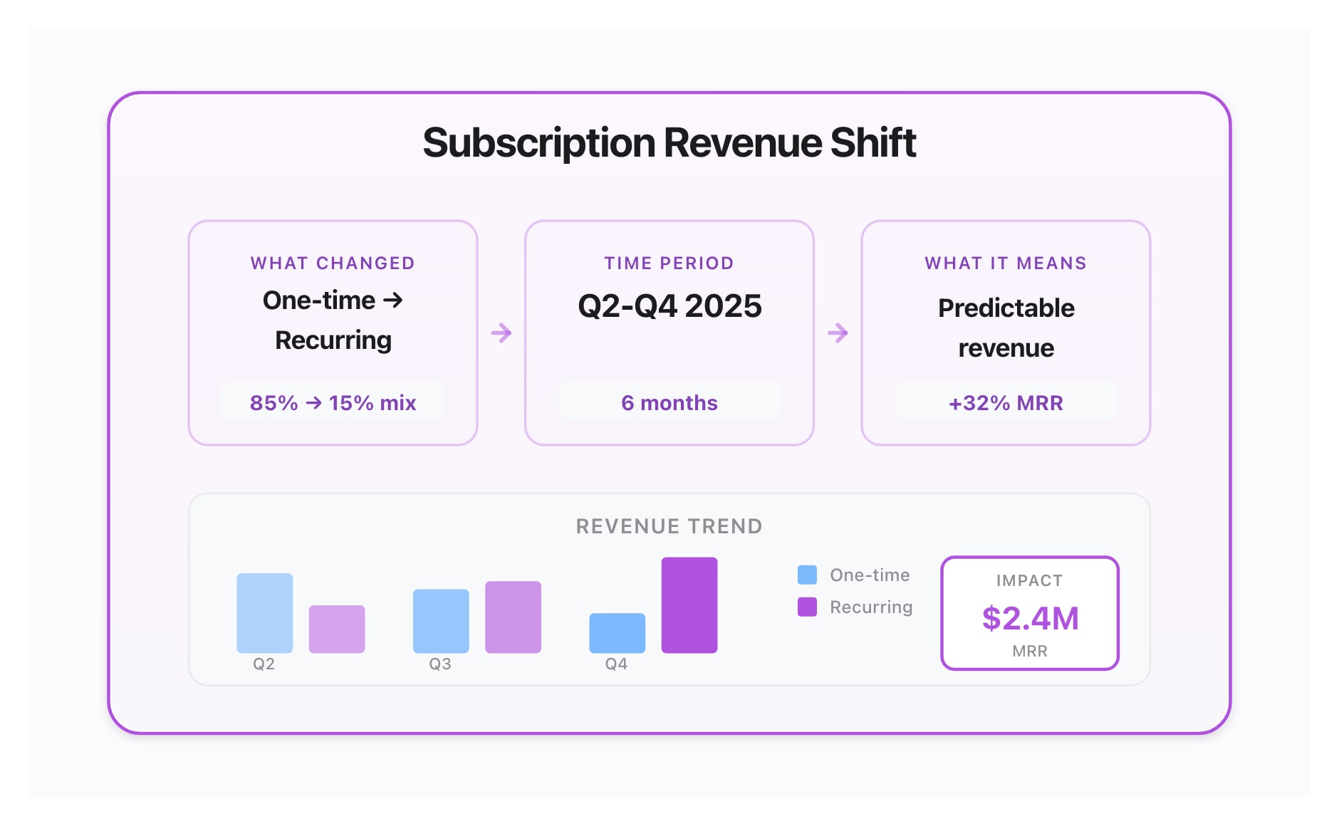
“What changed, over what time period, and what does it mean?”
This is the basic insight you’re building when you tell a story about data.
What’s the takeaway? Tools like Google’s NotebookLM make it possible for you to build sophisticated slide presentations with data-driven graphics. But are audiences going to tune out? You need to focus on the story you’re trying to deliver so that you get your point across. Generative AI is going to continue to improve, but you need to orchestrate it well to persuade your peers.