Whether you write consistently or not, you need to compelling visuals to get attention. I’ve noticed the most effective illustrations are simple, well-produced graphics that look like hand-crafted slide deck graphics. These are (up to this point) best built in a vector graphics tool like Figma or Excalidraw.
AI tools don’t do a good job creating informative graphics with relevant text, yet. With the advent of models like Nano Banana, we might have new ways to do this soon.
But for now, if you want to have deterministic outputs that get created from your non-deterministic prompts, one way to do that is to build your own graphics library.
Custom graphics improve your writing
When you’re creating content, it helps to have an anchoring graphic that feels professionally designed, consistent, and grounded in real data.
In Stop Building Slides and Start Building Stories, we talked about the importance of making a graphics pipeline to speed up your information visual work.
What better way to practice this than make a library to build the graphics in this style?
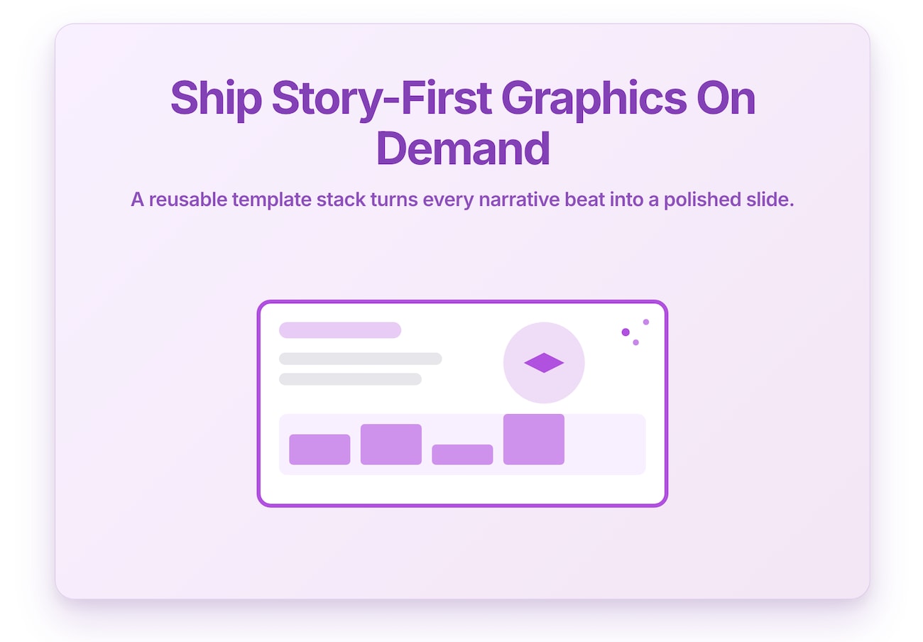
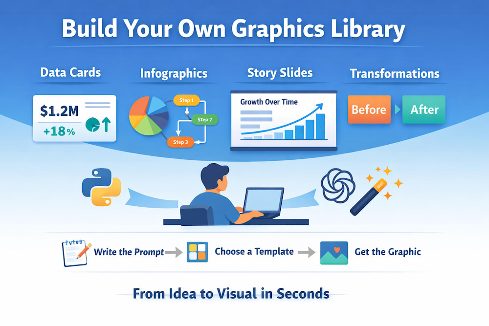
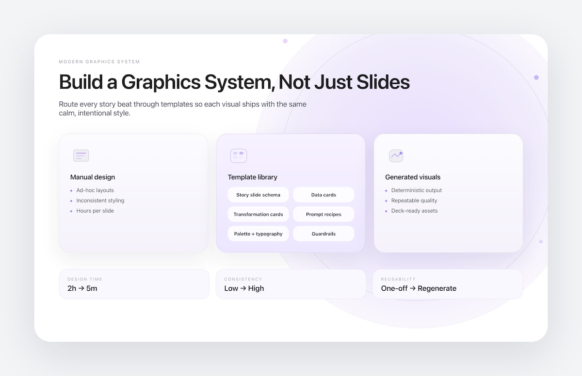
I created Modern Graphics, a Python and OpenAI-based package to build graphics and slides to illustrate articles.
This library packages the design system, prompts, and guardrails that let you ask, “Show me how revenue shifted from Q2 to Q4 and why it matters,” and get back a polished visual in seconds.
Why build a library to create images when you can use a Chatbot to do it for you?
As a curious developer and product person, I think the best way to learn about the limitations of technologies is to practice building them. The newest generation of presentation tools (NotebookLM, Pitch, Gamma, and whatever ships next week) can spit out decks faster than we can outline them.
That’s exciting, and also makes you miss the fine details you need to build a data visualization consistently, even if you have varying inputs.
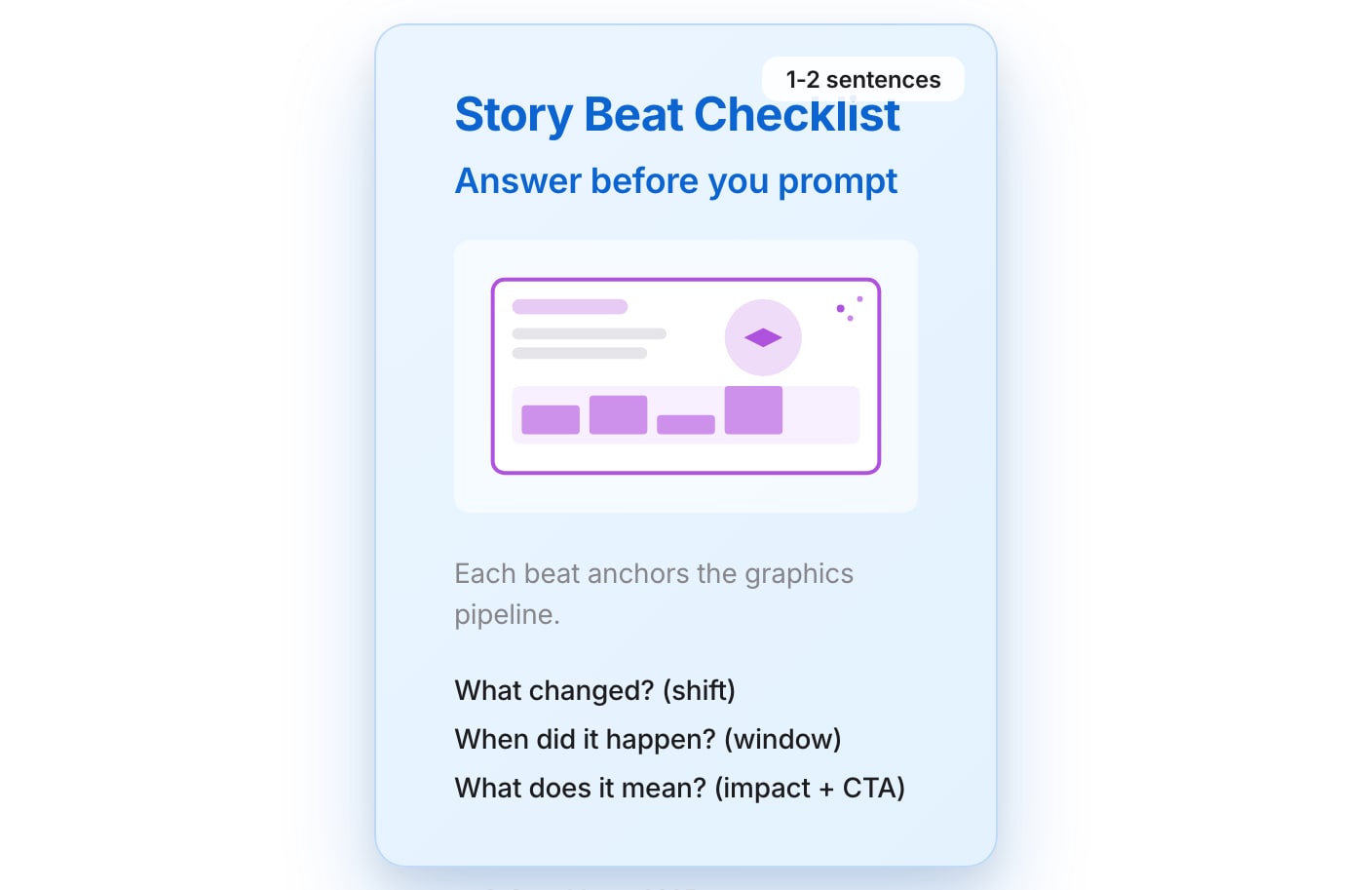
The real questions to build every visual around are deceptively simple:
-
What changed?
-
Over what time period?
-
What does it mean?
That trio gives every figure a narrative arc and keeps even auto-generated slides rooted in reality. Start there, and your templates become a delivery mechanism for insight instead of a factory for AI slop.
Said another way, how can you build graphics with a clear visual style while using AI tools to accelerate your output?
Here’s what you get when you ask Gemini and Nano Banana to illustrate this article:
And this is what you get from ChatGPT’s image generator.
Compared to what we saw a few years (or maybe even months) ago, these are pretty impressive graphics. But they also scream “AI generated.”
If you’re building bespoke graphics, you don’t want a generic outcome.
Use templates for a shorter path to great visuals
Think of templates as a kind of visual Eval (“evaluation” for those not familiar with AI development). Instead of trusting the AI output to be perfect, we create true/false tests to measure the difference between the expected AI output and what we received. Templates limit the creativity and the hallucinations of an AI implementation by constraining the output to a known set of fonts, colors, and shapes.
Evaluating how close the generated output is to a “good” image lets you know which model performs the best. We don’t (yet) have a good way to apply an LLM-based judge to a visual output from a model without building a series of evals, e.g. “tell me whether this is an effective graphic.”
I’m sure that’s going to be available widely in the next year or two. At that point the “visual template” you create is going to be a conbimination of a prompt and visual styling rules.
With a graphics agent in your back pocket, you can add a step to your workflow that’s simply “create some appropriate graphics for this article” and start the pipeline.
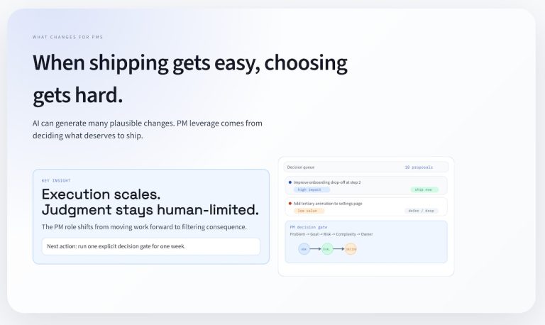
Here’s a sneak peek at what the Modern Graphics generator can whip up for you:
-
Data Cards: Perfect for those moments when you need to highlight key figures or achievements in a crisp format.
-
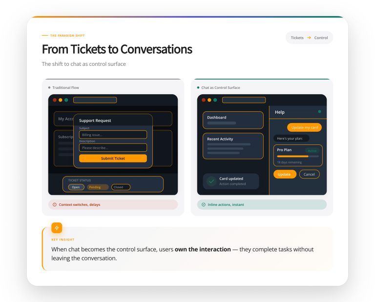
Infographics: Ideal for when you want to break down complex data into a compelling, easy-to-digest visual narrative.
-
Story-Driven Slides: When you have a story to tell, these slides help you narrate the journey clearly and compellingly.
-
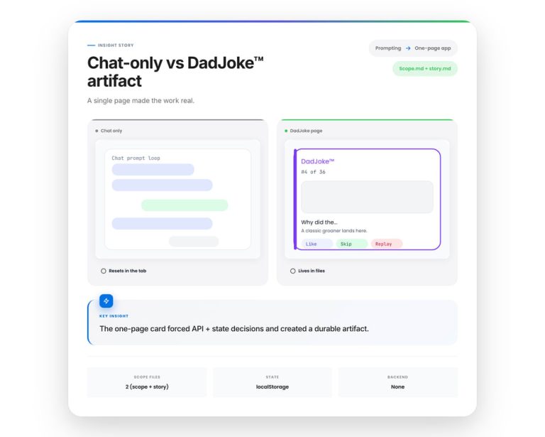
Transformation Cards: Great for showcasing before-and-after stories, be it a process overhaul or a dramatic turnaround story.
Think of it as your answer to those “can’t you just tweak the deck?” asks that always pop up ten minutes before the meeting. Instead of forking a Figma file and praying you remember every revision, you regenerate the graphic with updated data.
How do you move from prompts to slides?
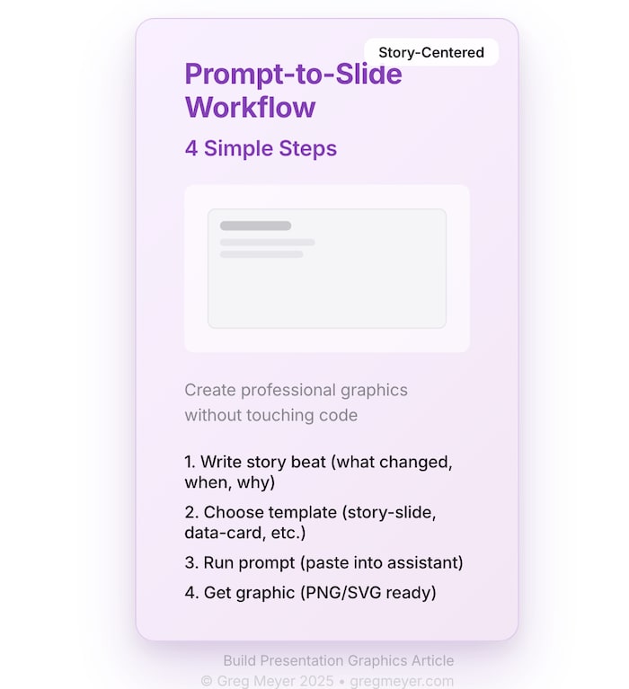
The whole point of the modern graphics generator is that you shouldn’t have to touch code to get a deck-ready asset.
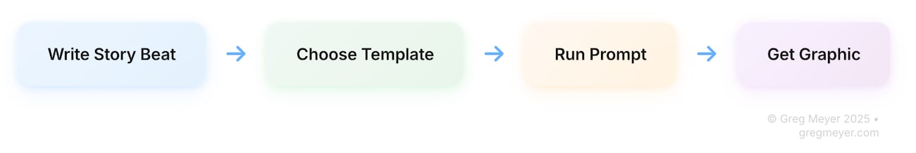
The workflow is intentionally short:
-
Write the story beat: one sentence answering what changed, over what window, and why it matters.
-
Name the template: data-card, story-slide, transformation-card, etc.
-
Paste the prompt into your assistant (NotebookLM, custom GPT, terminal helper) and drop in the numbers.
-
Receive the PNG/SVG that already matches your modern theme.
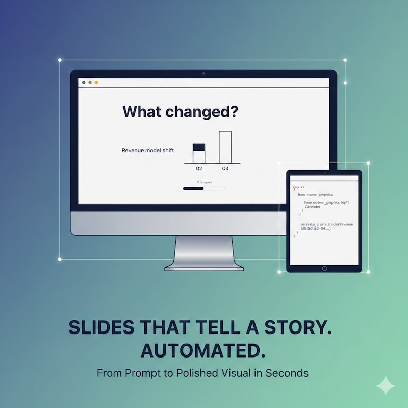
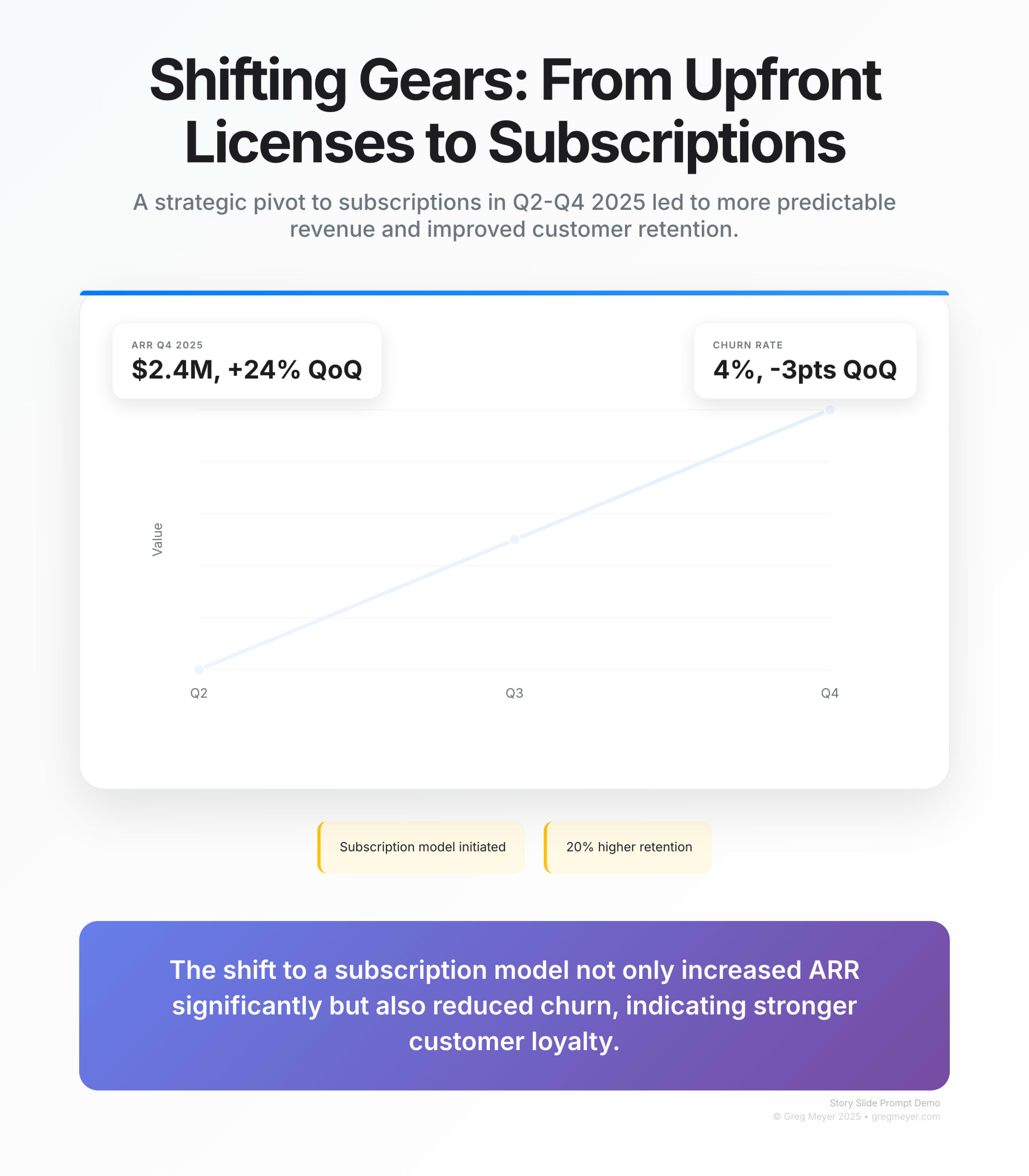
Here’s the exact prompt we use for a story slide:
You are the Modern Graphics Generator. Render a story-slide using the modern palette. What changed: Revenue model shifted from upfront licenses to subscriptions Time period: Q2-Q4 2025 What it means: Predictable revenue and 20% higher retention Call to action: Double down on usage-based tiers Include metric callouts for ARR ($2.4M, +24% QoQ) and churn (4%, -3pts QoQ). Return the image and a one-sentence alt text.Drop that into the agent, and you get back a slide with a bold title, the modern gradient background, two stat cards, and a CTA footer, with no timeline spent nudging boxes in Figma.
Behind the scenes, the workflow works because every template is really a schema.
Even the simplest “data card” needs a title, subtitle, metric, delta, and a plain-language interpretation.
Adapting graphics to match your style
How do you make this auto-generated graphic feel like your own? Create templates for your prompt. Adjusting colors, fonts, and layouts lets you dial in your brand identity, ensuring each graphic feels ready to publish.
Iteration also means testing the story, not just the pixels. Ask the “what changed / when / so what” questions for every draft image. If you can’t answer them in a sentence, the graphic probably needs another pass.
Before you run the Agent, write a single sentence that answers the story questions. Drop that sentence next to the command you’re running; it becomes both a test and an instruction for the template.
With a handy graphics generator and a sprinkle of template magic, you’re all set to produce engaging, brand-aligned visuals that elevate your content from good to unforgettable.
That graphic we were looking for from ChatGPT and Gemini? here’s how it turned out with this system.
What’s the takeaway? This is the practical follow-up to Stop building slides: now you can actually prompt a deck-quality slide that keeps the story at the center. The robots will keep getting better at spitting out decks, but it’s on us to orchestrate the story.