Brainstorming needs to be more than “ask Claude to solve my problem.” But when you’re using one of these frontier models, they optimize the response to give you the answer as fast as possible and in the fewest number of turns. This takes away some of the decision process: the part where you’re not sure and need to iterate until you reach a goal.
Yes, you can go back and forth with the model to refine your answer. But what if you don’t want that conversation to reach the cloud? If you’re not running a local model, you might think you don’t have a place to make that happen.
Hello! If you’ve got a recent iPhone with Apple Intelligence enabled, you’ve got an on-device model that can help you iterate through these decisions with some of the power of an LLM model and none of the data leaving your device.
What’s actually possible with Apple Intelligence as a decision-making model?
I decided to build an iOS app as an experiment to brainstorm decisions and get decision support from a model. If this works, the decision in front of you sharpens as you go and you can steer it while it does.
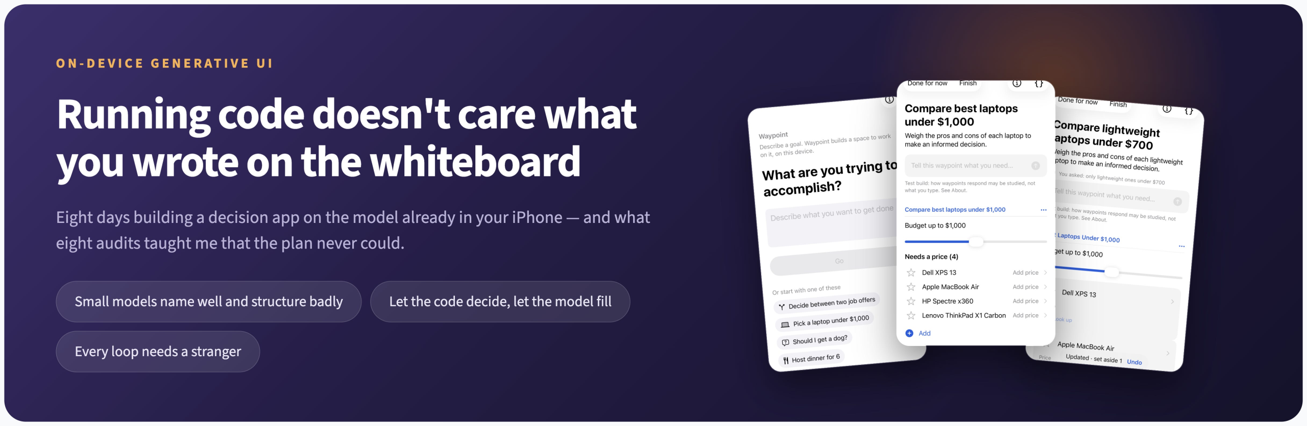
Here’s how this app works. You type a goal — help me pick a new laptop under $1,000 — and it builds a screen for that goal, right there on the phone. You steer it in plain language and it adjusts in place.
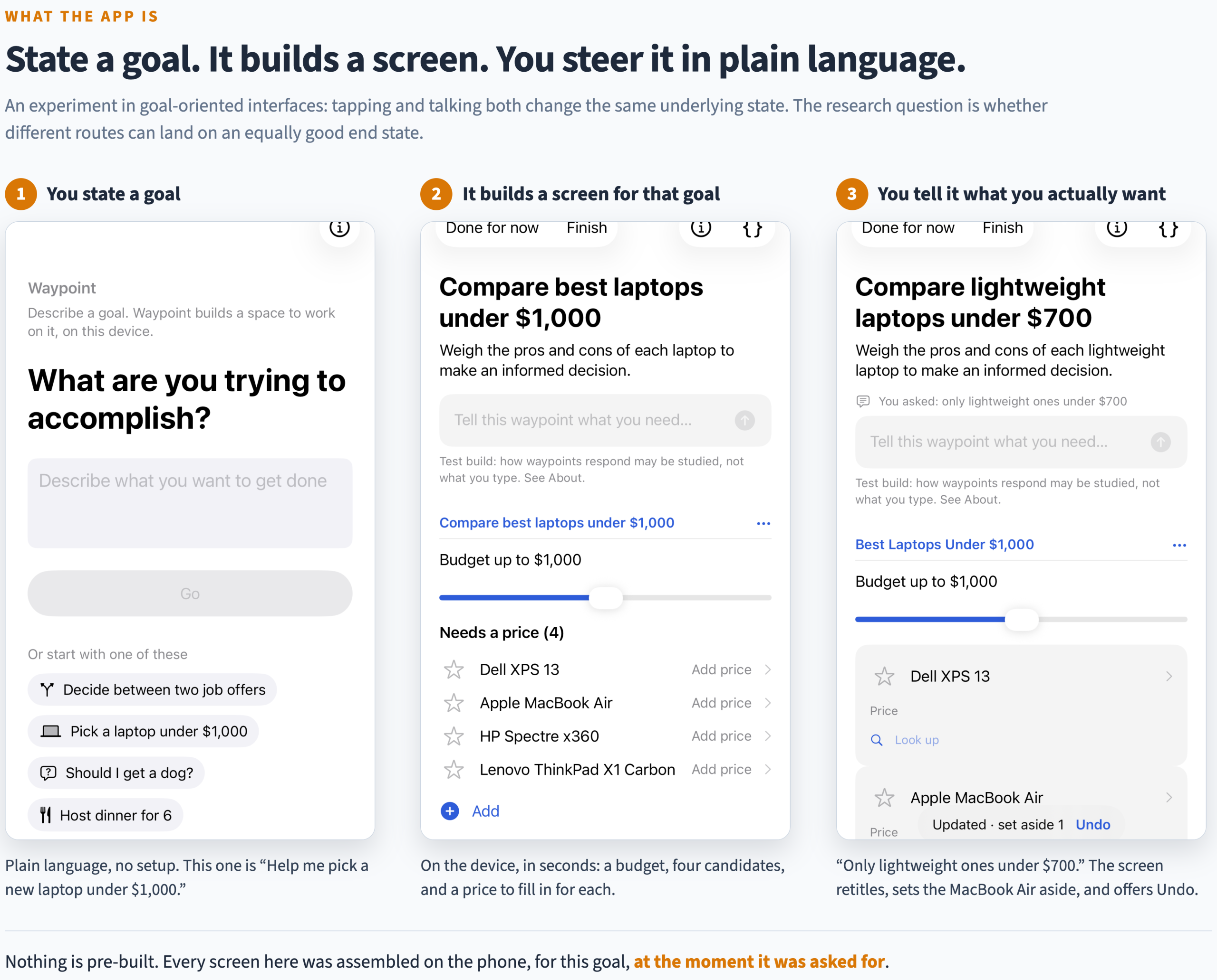
You’re not getting Claude or ChatGPT. This is a small model that can only hold a few thousand words in its head at a time, and a screen that has to appear in seconds so you don’t think it failed or went to sleep.
Making this work requires constraints, so I built a repeatable loop where you create a goal, refine it, and continue. I’m ready to start sharing this app with testers, and the answers I found were surprising.
Let the model build the interface
My initial idea was to have the model build the app screens dynamically, like Google’s A2UI protocol. We create screens out of a small kit of parts — lists, sliders, cards, checkboxes. In the best case scenario, the model can do all of this work.
But during testing this method failed seven times out of seven. Typing your goal looked like it was working, and it wasn’t. You’d wait, watch a spinner, and get a generic screen that didn’t match what you’d asked for.
(A quick aside: it’s pretty amazing that I could build an iOS app without knowing how to build an iOS app.)
The first problem I found was the length of the prompt. The small model running on the phone can’t generate a complicated screen on its own. But it can ask for a kind of outline, where it guesses what sections of a screen you might need and focuses on picking the relevant screen component for the problem.
Models do better choosing arrangements than assembling parts. This seemed like the outcome I was seeking. It took several audits to see that this conclusion was limited.
The model names beautifully and structures terribly
As I continued testing, it looked like the app was working. But there was something beyond the surface that was just wrong. The names of terms showed up correctly for my example tasks, across several domains: Dell XPS 13, Carvana, Chickpea Salad. But it had no idea how to structure that data into the correct context.
Here’s the same sentence — help me pick a new laptop under $1,000 — typed in three separate times, with three different answers to the question “what kind of screen is this?”
Run one built a list of parts instead of products.
Intel Core i5-1135G7 and i5-1135G3 are real parts. They are also not laptops in the way you’d find them in an ecommerce or LLM search, and nothing about the screen hints at the problem.

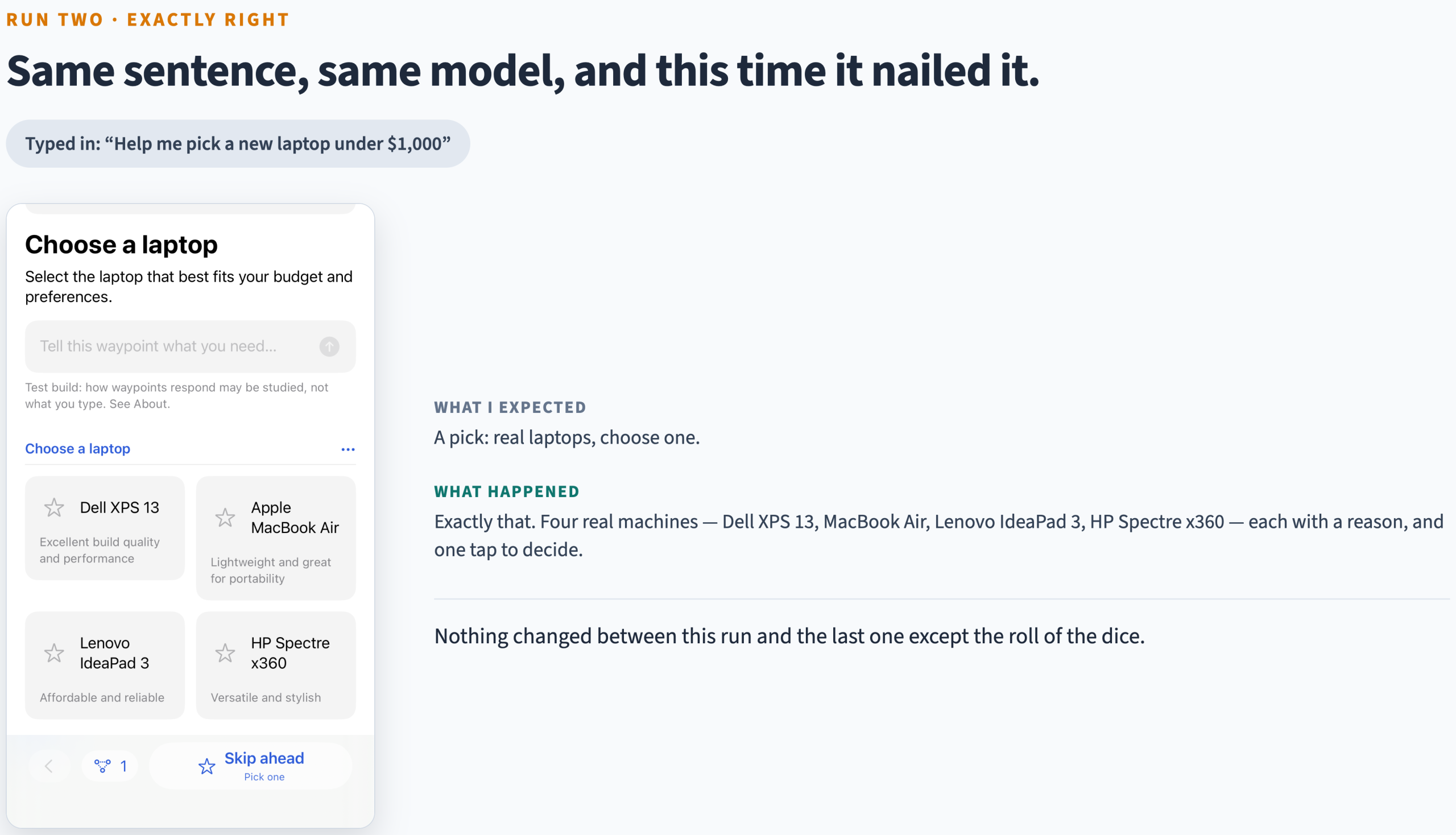
Run two got it exactly right.
Four actual machines, one tap to decide. This is a non-deterministic model, so nothing changed between this run and the last except the roll of the dice.
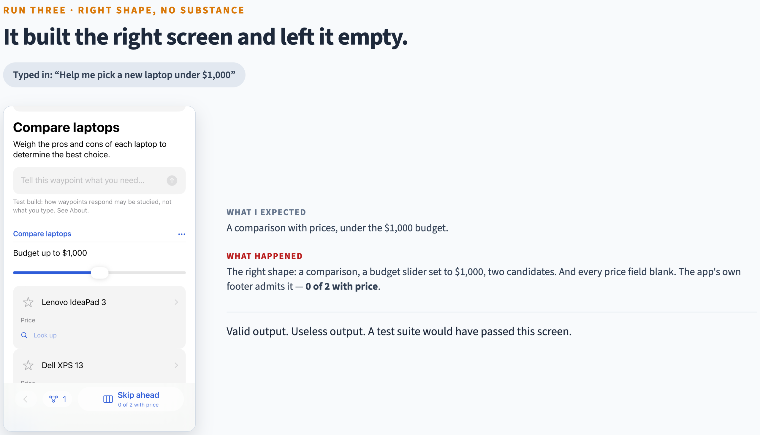
Run three picked the right shape and filled it with nothing.
A comparison, a budget slider, two candidates — and every price blank. The app’s own footer admits it: 0 of 2 with price. This is the worst of the three, because it looks useful and isn’t, and any test I could write would have passed it.
It did the same thing in other domains: cars to choose between for a goal about selling a car, three dinner dishes filed as requirements so “choose a main course” offered nothing you could choose. Every new session turned up a new way to get it wrong. So the question was obvious: how do you ask the question in a way where you get deterministic answers?
Make the code decide
The answer? Classify the output so that your “decision” turn always takes a known shape. That’s a much easier job for the model than dynamically painting a screen.
There are five shapes a goal can take — a list to work through, a set of options to choose between, a comparison, and so on — and ordinary code decides which one fits. The model never picks. It just fills in the blanks and names what goes in them.
I built both versions and ran the same sixteen goals through each.
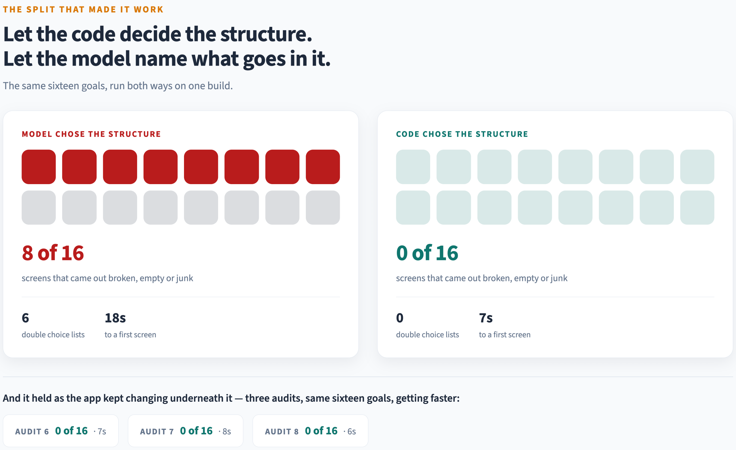
The gap is the whole argument. Half the screens came out broken when the model picked the structure and none did when the code picked it, and the first screen arrived in a third of the time, because one clean request replaced a request plus its repairs plus its retries. That was one comparison on one build, so I kept re-running those same sixteen goals as the app changed underneath them. Three audits on, it still holds — and it keeps getting faster.
That’s the insight, and it’s worth more than the app: on-device generative UI works when you stop asking the model to decide and start asking it to name. A small model on a phone is a superb naming engine and an unreliable architect. Give it the slots and it fills them fast enough to feel live. Give it the blueprint and it will hand you a confident, well-spelled screen offering to sell you a CPU.
Two supporting rules came out of the same eight days. Check that the output is useful, not just that it’s well-formed — my checker was happily approving flawless descriptions of completely blank pages. And when your fix for a model mistake is a second call to the model, look again: twice, on unrelated features, the right answer was to delete that call, because what I’d been asking the model to work out was already sitting there in the user’s own sentence.
That one is only half true, and I’d rather say so than let it stand. Deleting the call fixed the loud half completely — messages that asked to add something stopped rewriting the screen out from under the person, 0 out of 22, down from 11. But the quiet half didn’t land. Reading the exclusion straight from the sentence only works when the thing to exclude is spelled out in what’s on screen: “not Apple” catches an Apple MacBook Air and sails right past a MacBook listed without the brand. Two exclusions caught out of roughly ten. The answer was in the input, but plain matching only reaches a fifth of the way to it.
None of that came from thinking about it
Here’s the part worth generalizing. A brainstorm can only give you ideas you already believe. Running code doesn’t care what you wrote on the whiteboard.
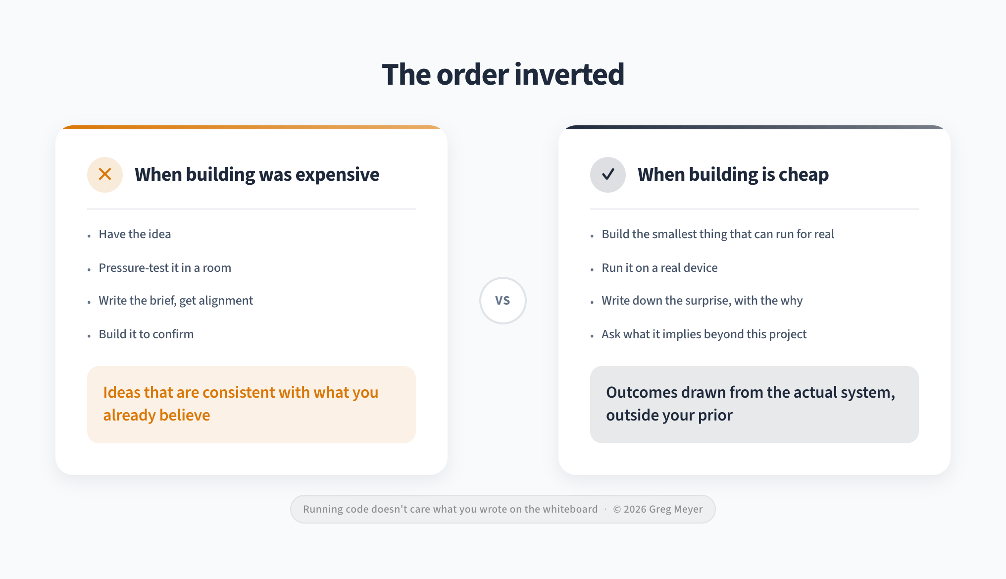
“The model sometimes picks the wrong structure” is a shrug you nod at in a meeting. A screen offering to sell you a CPU is a finding. The second one costs an afternoon now, which is the thing that actually changed — and the practice that fell out of it fits on an index card:
-
Pick the next smallest thing that can run for real.
-
Run it for real — not the simulator, not the test suite.
-
Write down the surprise in one line, with the why attached.
-
Ask what the surprise implies beyond this project.
-
Pick the next smallest thing.
The third line does all the work. Without the why, you have a changelog. With it, you have a pile of surprises — a hundred-plus in eight days, a third of them with nothing to do with this app at all.
Which is the same shape as the thing I set out to build: improve at every step, don’t try to arrive all at once.
What we can’t answer
The app was built to test two things. The first — can an on-device model generate a useful interface — building answered.
The second test is open: do people find this useful as a UX metaphor and as a way to answer and think about goals? That’s the next step here.
And I can’t answer it with my own numbers, because the one I trusted most turned out to be measuring me. When the app finished a screen it would propose what to add next, and those proposals were getting accepted 21 times out of 21 — which looked like enthusiasm and was nothing of the kind.
The number moved every time I changed which button was easiest to press, and never once tracked whether anybody wanted what the app proposed. The last reading is the worst, because the only person clearing those screens already knew what they’d say. He wrote them.
Every loop needs a stranger
The loop is superb at generating transferable ideas, it will generate them forever, and every single one of them is a legitimate reason not to go do the expensive thing. Surprises are cheap and self-replenishing. Contact with someone who isn’t you is neither — and the surprises are real, which is what makes them such good cover. I fixed two genuine bugs the same afternoon I wrote “seventh audit without a single outside participant” in my own notes. The next audit logged it again, verbatim, with the number changed to eight.
Now we’re at the important part. Building is the brainstorm. But a brainstorm you never leave is just a very productive way of not knowing. So now I need testers.
If you’re interested, send me a note and I’ll invite you to TestFlight.
What’s the takeaway? Small models are naming engines, not architects. If you want to use them like large models, you need to change your approach. The outcome might still be better than what you had before.