
Attribution – the process to understand the source of a conversion – is complicated. In a lead process (or any other process), everyone wants to know what contributed most to a successful conversion. The problem is that there are often many different factors that result in conversion. This analysis is multivariate. There appears to be one thing that caused the conversion (maybe the last thing before it happens). But there might be additional unseen reasons that a conversion occurred.
To handle this multi-stage process, many organizations default in the prospect process to simplifying the customer journey. They track the first seen source for a lead or the last item directly before a conversion action occurs. When you track first seen or most recently only, it’s easier. In a customer journey you either constantly write a source only once (first seen) or you overwriting the value whenever you see something new. In the latter process, you stop rewriting the value when the process ends through conversion or abandonment.
Simplifying attribution improves the ability to see where a lead came from most recently. You always know where the conversion originated because you have the definitive value. Depending upon your tactic, you will have either the most recent time you saw a source or the first time you saw a source.
The problem with storing a single attribution value
Here’s a small wrench in that argument. When you track attribution, you don’t know where the important thing happened on the multi-step prospect path your prospect took. The thing you want to find is the most meaningful part of that journey, whether it resulted in conversion or not.

The customer journey is a winding road, or a straight one, and it’s difficult to predict in advance. One way to track multiple customer events is to count all of them. You end up creating a table counting the number of times a prospect passes through a particular event and focus on the segment of prospects that convert. (For those who use Salesforce, this is akin to using a change history table to track changes in a particular field and generating a list of possible paths to goal.)
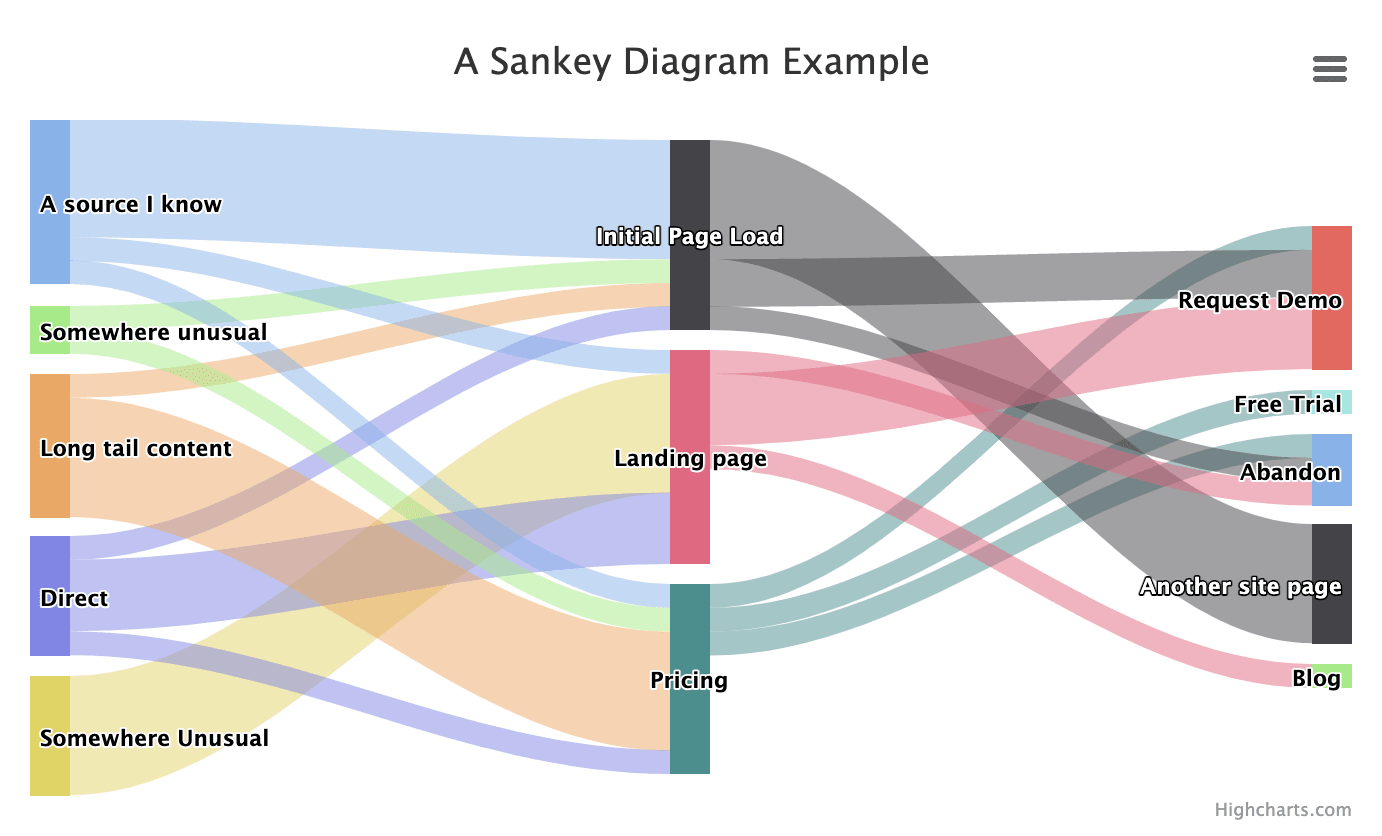
Another way to do this analysis is to use a Sankey diagram. Named for a ship captain who created a diagram of steam engine efficiency, a Sankey diagram is a visualization that shows the flow of information between nodes in a graph while also displaying the volume of that information. Sankey diagrams follow the river of information for the customer journey as it happens and demonstrate signposts along the way.
One famous example of a flow graph that resembles a Sankey diagram is this illustration of Napoleon’s invasion of Russia.
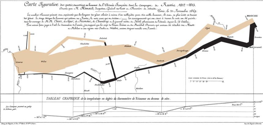
The visual demonstrates the track of the army through Russia and the number of soldiers who remained on the retreat. By showing the flow and change of the information as a time series, you get a real sense of the situation that a static table of changing information at different time intervals cannot provide.
Why use a Sankey Diagram?
Sankey diagrams help you tell the story of your data. If you’re attempting to model a customer journey, seeing a visual flow of the information may highlight important edge cases and also give you a sense of the most likely outcomes at a glance. Adding a filter for user attributes to your data visualization will let you look at a lead segment at any point in the customer journey and compare the from node, the to node, and the weight.
So what? A downward change in the weight of a node as you move from stage to stage suggests either a dropoff by abandonment or a new path in your customer journey that you have not yet considered. In contrast, a stage that gains weight from multiple sources could be a popular destination in the customer journey or perhaps simply a red herring (lots of people end up on a pricing page). It’s the next stage beyond that one that is interesting, as you can see if there is a subsequent dropoff in the funnel.
Combining filters with the visual explanation you get from a Sankey diagram lets you see in more detail when there are different kinds of journeys happening and overlapping in your overall customer journey. Seeing paths by persona or paths by initial entry point will help you to find leaks in the funnel or areas where you want to increase your investment.
Finally, Sankey diagrams let you avoid the false positives happening today in your data when you get a lot of traffic from a single source – an ad campaign or a content item or an event – and you don’t know exactly where that traffic goes. By overlaying the events and paths you do know about with the hidden events and paths emerging in your systems, Sankey diagrams give you a kind of x-ray vision into the customer journey.
What’s the takeaway? Sankey diagrams are an effective way to show information where the paths are varied and the team would like to analyze the best path to a goal. Because this visualization shows all the paths at once, filtering the the underlying information is an effective way to uncover what’s going on.