
The third post in the Path to PLG Success series talked about the building blocks for quality and consistency in reporting so that Data and GTM agree on the goals for analyzing the business. To achieve revenue goals with product-led growth, we need to measure and act on the right things.
Tl;dr: the three things we highlighted were the basics for accurate and reliable reporting, how to document and show your work, and building a cadence of quality and consistency.
We’re all about finding ways to help data and GTM teams work better together and drive growth for their companies. In this final post of the series, we’re taking a look at how to best visualize data so that GTM teams can easily understand the data and take action.
Data Visualization as a Catalyst: Inspiring Action and Driving B2B SaaS Growth
If you know, you know. 🫡
Selecting the right visualization and presentation for data is not always easy. Presenting data the right way is the difference between making an impact and your hard work just sitting on a shelf. Make sure your data visualizations are tailored to your audience so they have the desired impact.
Let’s dive into the key aspects of building your data viz strategy.
What is data visualization, exactly?
Data visualization is the graphical representation of information and data. It uses charts, graphs, and other visuals to show trends, insights, and metrics from a data set.
If you’d like a primer, here’s a lecture to view from a Stanford professor:
A Brief History of Data Visualization
It’s long: you’d probably like a tl;dr instead.
Data visualization starts from the expectation that viewing this information will be informative, timely, and useful.
-
Informative means that you learn something you didn’t know before or are enlightened to something presented in a new way.
-
Timely suggests that the visualization either provided necessary information during a time bound or that you are depending upon it to answer a question.
-
Useful indicates that after viewing this data visualization, you apply the knowledge you gained to advance a solution, answer a question, or solve a problem.
Data visualization needs to be well-designed and easy to consume to live up to these expectations. Let’s simplify the expectation of “well-designed” to include properly formatted use of color, font, and information architecture to highlight needed information.
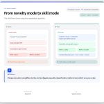
Standard options in Google Sheets and Microsoft Excel often complicate a design.
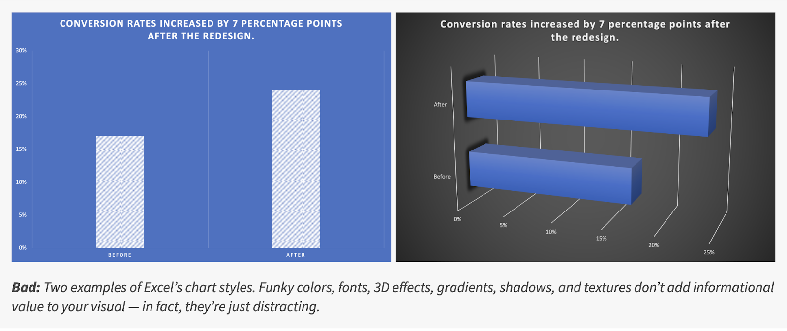
What’s the difference?
Even in this simple example, there are several different formatting options that take away from understanding:
-
The use of shading on a data series doesn’t help to explain the information
-
Grid lines in a rotated figure are confusing because you’re not sure where to read the values
-
A high contrast fill color on a darker hue background is easier to read than a similar hue on a dark background
-
Even the title case and legend on the first figure here is easier to read at a glance than the one on the right
There’s a lot to think about when you are building dataviz!
Here are a few heuristics to help you think about the elements of a data visualization.
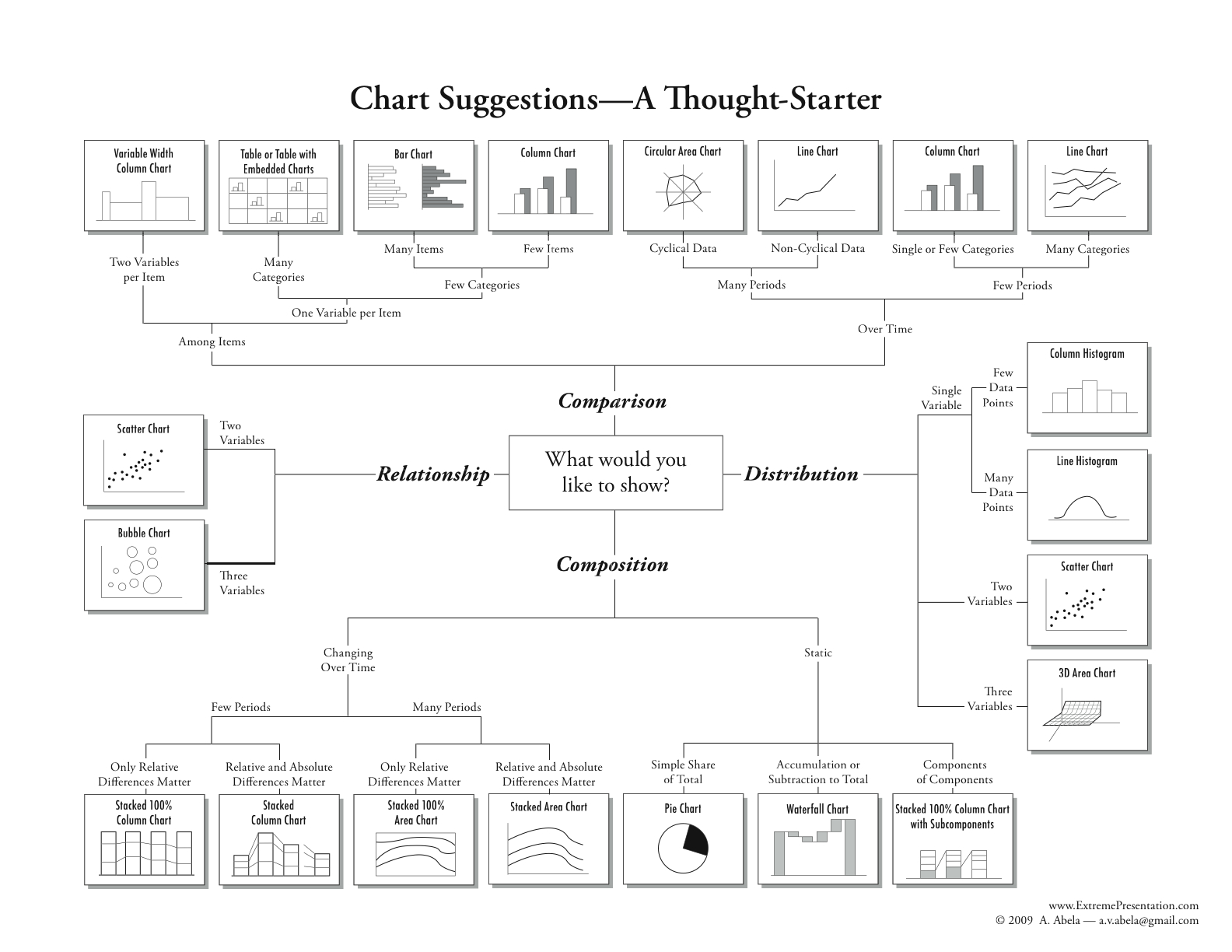
Information Architecture Basics
The “information architecture” refers to the structure of the information you are placing in your visualization. What data are you trying to explain, and what is the single most important output of the visual?
Usually, the data will fall into a few categories of information:
-
A single value like a metric or goal (how many customers do we have?)
-
A time series of information (what does our week-over-week cadence of leads look like?)
-
A rolled-up summary of information, such as a pivot table (what’s the breakdown of the current pipeline by opportunity types for a series of quarters)
Single values need to be explanatory and atomic. If you found them without any other metric, are they understandable? Can you use them as the authoritative source for information? If so, you may want to arrange or flag them differently, like placing them within a dashboard of authoritative metrics.
Time series track the change in a value or values during a date range. This is one of the most common forms of data, and answers the same question for a series of date ranges, e.g. “how much did we sell when we group that data by week or month or quarter. By filtering this information, you can add segmentation or group by different flavors of similar data, such as showing the lead performance by source over a time period.
Which visualization will you choose?
When you’re building a simple graph or a dashboard, the type of visualization you choose goes a long way toward getting attention. (A quick hint: just say no to pie charts.)
Tables are a powerful and easy to overlook type of visualization that make it easy to scan a large amount of data in a compact area. For example, you might want to look at all of the power users within an account and want to quickly understand who is using the product the most by sorting a column of usage (PQLs).
Metrics are easy to consume and are great to have at the top of your visualization, especially when you are combining information on a dashboard. They provide an at-a-glance answer to a question.
Bar and line graphs tell a story over time but can get overwhelming as you add too many data series, or start combining data into presentations with information on multiple axes. Comparing a conversion rate on one axis to the number of leads added by week might work, but adding another data slice might be confusing.
Funnel graphs demonstrate the conversion through a journey and usually use the progression of ordered stages to show success. For example, you might compare user status in a PLG motion offering self-service by showing the total number of trial account prospects, and then the prospects who took the next action like logging in after an initial visit, and then those who were highly qualified, and finally those who purchased.
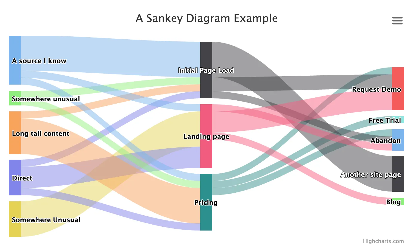
A Sankey diagram is a more exotic type of visualization that show data progression through multiple stages to multiple endpoints, as in multiple attribution scenarios.
Don’t forget about colors and fonts when you are thinking about data visuals.
Color usage
It’s fun to pick colors to use in data visuals, and using a small number of colors will help your graphics have more impact. Think about using a single color for headers and another for body copy.
Reserve the use of well-known color symbols (e.g. “traffic lights” are red, yellow, green indicating stop, caution, go) for items in a visualization where you want people to react. If you are indicating similarity, think about using different shades of the same color family rather than arbitrarily picking different colors for different series of data.
Font usage
If you have the option to use different fonts in a data visualization, think twice before you take that option. It’s a lot easier to understand what’s being displayed if the information is presented consistently. That means typically limiting yourself to one font and perhaps 1-2 font weights (bold, regular, etc).
Font sizing matters too – if you have more than a few font sizes in a graphic it will get hard to read. As a general rule, use one font size for the header (usually one to two sizes bigger than the information in the graph) and stick to that.
Designing action-oriented data visuals
You have only a few seconds of viewer attention when you create a data visualization. Where do you want those eyes to land?
Arranging your visuals into usable chunks short-circuits our brains to pay attention to things like headlines, colors, and calls to action.
Start with the headline, a title that lets you know what question you are answering. In the example below, the title would be stronger if it led with “Market Activity: compare this month to last month”. In addition, using the same color scale for adjacent visualizations might be confusing unless there is a clear visual break between these cards.

Matching the headline idea to the visual and limiting the elements where you want people to focus increases the chance they will get the insight and be able to apply it elsewhere.
Adding a call to action
Bonus points to you if you make it possible for your team to move from insight to action while they are viewing the visualization. For example, if you saw that the number of seats utilized within an account was less than 50%, you might add a button to your table row that sends the customer an email to demonstrate how to share or to get more information.
What do GTM and data teams need to learn to build better data visuals?
Trust in data starts with good information and visual design, but goes beyond that. One industry team suggests the following rubric for effective product analytics, which is a good model for data visualization in general:
-
Promote Data quality – it’s the most important input for believable data visuals. If you don’t trust the data, you’re going to stop looking at the visual
-
Enable self-service – visuals that let you filter, understand, and explore the data build trust that the current information could be extended to new questions.
Using these ideas, data teams might organize their data ideas in this way:
-
Data sets are the queries teams use to search and organize data. They need to answer a fundamental business question, even if they output a single data value. An example: “select the list of all opportunities, so that the GTM team could filter and group them by stage, type, and date range”
-
Data cards combine the visual representation of information to answer a specific question using a data set, such as “what is the average age of closed lost opportunities compared to closed won opportunities?”
-
Dashboards arrange related data cards into a series of answers along a theme. For example, you might create both a Sales and a Service dashboard, arranging information from similar data sets for different audiences.
Putting it all together: Data and GTM teams
The path to drive growth depends upon solid data, clear next actions, and teams that collaborate to solve problems. Data and GTM teams are key participants in helping the larger team to reach their goals. When teams focus on clear design, well-documented data, and visuals that answer key business questions, it helps the whole business move forward with action-oriented next steps.
What’s the takeaway? The path to making data visuals informative, useful, and easy to consume is clear. Think carefully about the next action you’d like the viewer to take when they see your visual and craft the information and viz type to match.

