

As an operator, how many times do you get asked: “how are we doing this month vs last month? (Or vs. some previous month). Probably a lot.
Whether you are comparing sales performance among reps, tracking the pacing of a metric by the historical day of the month, or just want to see how you are doing, cumulative sum graphs are the data visualization that you want to build to get more insight into how series data changes over time.
What’s a cumulative sum graph?
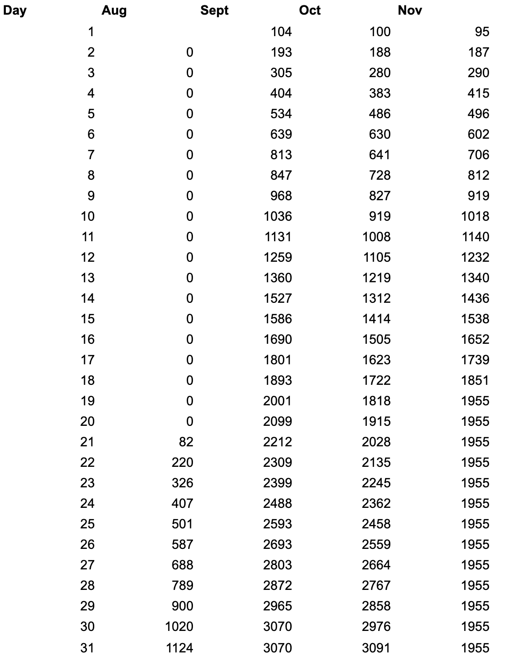
A cumulative sum graph adds up the column values of a series by row. In an example data set like the one below, this means that on September 1, the team saw 104 leads and then saw and additional 89 leads on September 2, meaning the cumulative total of leads for the team was 193 on September 2.
Building the graph in this way lets us compare different time periods (in this case, the day of the month by a month-over-month comparison) visually to see the changes in pace represented by the slope and the intercept. Said differently, that means that a better initial pace through the month will appear both steeper (up and to the right) and at a higher reference point overall.
Cumulative sum graphs display velocity and performance, which is key for any operations team to view.
How do you build this graph in Google Sheets?
First, you need a time series data set representing the information you’d like to display. I used a version of this lead arrival data set and added a random date in the last 90 days to establish a baseline. If you’d like to follow along, make a copy of the data here.
Next, you’ll need to pivot the data to achieve the rows and columns for the data. Transform the arrival date of the lead in the original data set (column B) as follows:
-
Use
=Day(B2)to get the ordinal day of the month -
Use
=Month(B2)to get the ordinal month
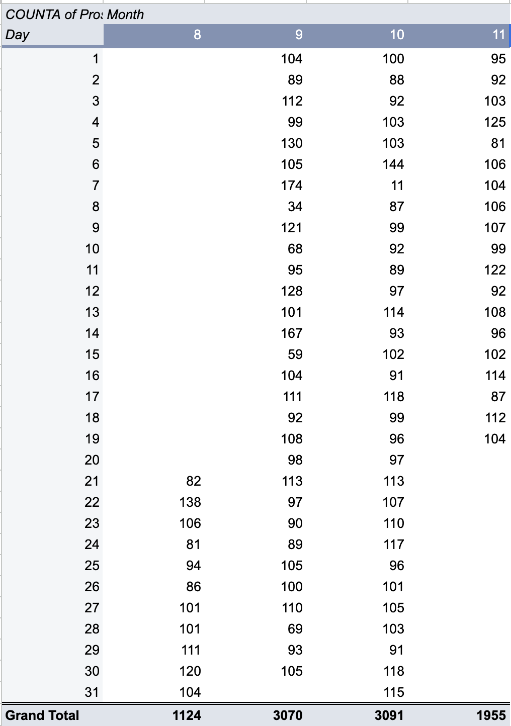
Now you can pivot this information, selecting Day as the row, Month as the column, and the ID value of your lead (anything that’s unique) as the value for counting.
The resulting pivot table looks like this:
Google Sheets is missing something
You might have noticed a problem with this pivot table. There isn’t a straightforward way to create a cumulativeSum function (you can use tricks like this, but it’s not simple).
The pivot table gives you the count for that date, but not the cumulative count for the month where the count for day 1 is added to the count for day 2 and so on. This means you will need to create a parallel helper table to drive your visualization.
Here’s how to do that:
-
Copy the columns and rows of the pivot table to an adjacent set of columns so that you have the shell of the same pivot table
-
Start with the cell for the first month, day 1 and reference the pivot table’s cell for month 1, day 1, e.g. something like
=B3 -
Move your cursor down one row to Month 1, Day 2 and create a formula to add the total from the cell above to the day total for day 2 created in the pivot table, or something like
=B4+I3where B4 is the total number of leads counted in the pivot table for day 2 and i3 is the cell for your new table in the row above -
Now copy this formula all the way down your row
-
Now copy the column’s formulas to the right for as many months are in your data set
-
Touch up the column headers to match the month name, e.g. replace 8 with “Aug”. You can use
=TEXT(DATE(2023, C2, 1), "mmm")as a shorthand to take the month number and format it as a short month name
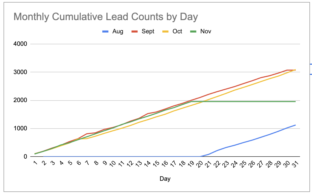
Great! Now you have a data set that you can visualize for a month-over-month comparison.
Creating the graph in Google Sheets
Highlight the rows and columns in your new graph, select the ribbon option to Insert Chart, and you’re off and running!
Style your graph, rename the title, and you’re ready to share this with your team.
If you configure a reverse ETL automation to push the data into Google Sheets, you’ve now built a dashboard for your team to review progress month over month. Add filters on your original data set or on the data viz to constrain the date range, and your team will thank you!
What’s the takeaway? Cumulative sum graphs are a powerful method to compare time series among like groups and periods. Use them to measure rep performance, historical performance against goal, or other time-based measures. Once you get the hang of it in Google Sheets, you’ll be able to build this data structure elsewhere.