It’s the beginning of the month, and the same conversation happens at the beginning of every month, quarter, or year: “how’s the pipeline?”
Pipeline is a tricky thing. I’ve heard it described persuasively as a bathtub where the level of pipeline (water) rises and falls as deals enter (leads) and leave (closed lost or won). That means it’s changing over time and difficult to see the rate of change on a day. But everyone pays attention at the beginning and end of the period.
The end results are pretty easy to measure. Did you make your new logo, MRR, SQL, and MQL targets? The beginning of the period is not quite as easy to estimate. Dear SDR Managers, Sales Leaders, and Ops Pros, I made this Google Sheet for you.
A tool to learn more about the inputs to pipeline
Pipeline is all anyone wants to hear about in the sales management process. We do a great job focusing on individual deals and don’t always focus on the input activity that results in outcomes that are closer to what we want.
Pipeline growth comes down to a few things.
Are you working each deal fully enough and quickly enough, while not hanging on to failed deals for too long? Do you have enough volume to make your number? And do your conversion rates support the number of leads you’re getting?
One common challenge I’ve seen working with sales teams and ops pros is the ability to look at what we have and estimate what we will need to do to make the goal. I made the Google sheets template to make it easy to plug in your various ratios (lead-to-MQL, MQL-to-SQL, SQL-to-win) and your deal goals (new revenue, average size deal, number of logos).
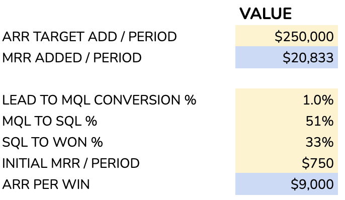
The yellow boxes in the model represent numbers to change, while the blue boxes indicate outputs from that model.
Combine this information with the number of reps, you’ll have a quick ratio of the number of deals they handle. Specify the percentage of reps who make quota and you’ll see a result that suggests you do or do not have enough pipeline. (Hot tip: expecting all reps to make quota is probably a misapplied assumption).
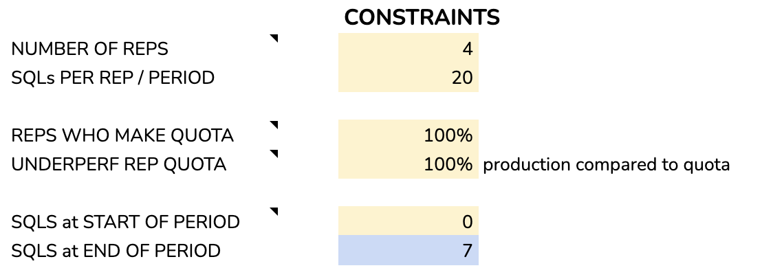
You can also specify if you start the month with pipeline added from the previous month.
What does this tool tell you about your pipeline?
This tool is not going to replace your forecasting efforts. It will give you an idea of where your model has rough edges. Think of it as an early warning system for not having enough deals, consuming too many deals, not being resilient enough to handle when conversion rates change, or when reps don’t make their number.
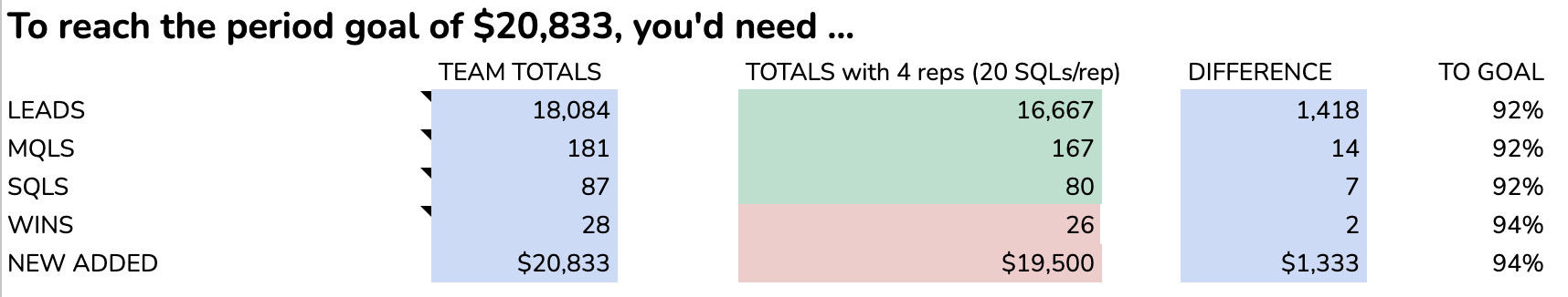
When you use this Sheet, play with the variables to see how the outputs change for the model. With the number of leads you get and your success rate, does it help you more to improve your closing rate or to raise the average revenue per account? If you add another salesperson, do you have enough deals to source your SQLs for that person?
With this sheet, you will be better able to get a sense of whether you are succeeding or not in the early part of a period. Estimating during the period is especially important at the beginning of the period because salespeople are tired and they haven’t switched from closing mode to business development.
If you consider Parkinson’s law, the duration of bureaucratic work expands to fill the available time. If don’t point out the pipeline gap early in a period, people might not notice until it’s crunch time. Use a tool like this one to find the surprises early – and you’ll have enough time to react.
Let me know if you have suggestions for this tool, or if you have requests for Google Sheets revops templates.
What’s the takeaway? “Pipeline management” sounds like a wonky term, but a big chunk of the effort is making sure that the activity and results that are happening translate into the expected results for the organization. Using simple spreadsheet models helps the team react to changing conditions and create sensitivity analysis for the possible outcomes.