Let’s do a thought experiment. Can you imagine a simpler version of your product? Something much simpler, instead of removing one dial or switch.
Think about the difference from Excel that caused Google to acquire the technology that become Google Sheets. Or the simplification of Notion vs. Google Docs.
These are changes that created a simpler looking UI and opened up very different versions of the parent product that they started from.
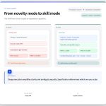
What kind of simple are we looking for?
It’s easy to start thinking about creating a completely new interface for a familiar tool, but really hard to make a meaningful difference. You might think of starting with a blank page as a blunt force method of doing something difference. I think starting with the most frequently used flow in your application is a great place to innovate.
You could use Salesforce as an example here. A very frequent thing that happens is updating an account with new information. Software like Dooly, Scratchpad, and Troops (before Salesforce bought them) attempted to take one match (the ID of the account) and update the flow:
-
Sending new information via Slack and receiving a response
-
Creating a new UI on top of Salesforce and making it very fast
-
Why didn’t they just use the underlying product and create a user profile that could do only a few things and only saw very few objects and fields?
The underlying goal here was reducing the complexity in the tool people use every day and the result was more complexity in creating a different workflow people are asked to follow.
Avoid Too Many Choices
Two researchers tested the theory of too many choices in a California supermarket in 2000:
The experiment was set up this way: one group of shoppers was offered 24 different varieties of jam at a tasting booth, while the other group of shoppers selected from a group of 6 jams. Shoppers were allowed to taste as many jams as they liked, and all got a coupon that enabled them a discount on a purchase of jam. The study was run on a few different weekends and had hundreds of participants.
The group that had fewer choices had a take rate of 30% and the group with more choices only 3%. In this study, fewer choices caused a 10x better return.
Product complexity looks like too many choices to your customers.
A hackathon project (or an a/b test)
Start by picking a few things people do most often in your product. Now, build a parallel interface or a/b test that lets them try that out.
After a few days of use, ask the different groups of users if they feel satisfied with the software and their ability to get things done. Power users – if they get sorted into a test – might not like this outcome, but if you give them a hidden way to find their old workflow they will figure out where to go.
Yes, this is an extension of the strawberry jam experiment. Placing complexity in the product where it is important and in context is the key to producing a powerful feature. Yet that same feature can sometimes feel really confusing to a new user when they don’t know why it affects something they were already using.
If you need a great example of this, turn on Focus mode on an iPhone for someone and ask them to turn off their Do Not Disturb. If they haven’t been introduced to the feature it will seem like their previous functionality has had a breaking change and just doesn’t work any more. But someone who values the ability to shape the specifics of when and how they could be disturbed probably thinks the new feature is great.
If it’s not easy to change the entire interface, think about how you can add pre-selected options to the most standard workflow to remove steps and choices. The goal? Figure out which choices your users would prefer you make for them.
What’s the takeaway? Complexity builds in applications slowly over time to a point where if we’re not trying to make things simpler it can get really confusing to the average user. To shake things up, think about testing radically simpler interfaces (either using new UI or by pre-filling existing UI) to confirm whether all the choices you are asking the customer to make are necessary. If you can make things simpler, they’ll probably buy more often.